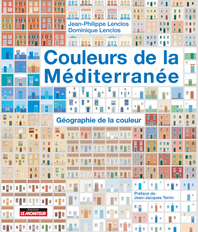
Fascinated by the Mediterranean basin and the richness of its islands that have preserved the characteristics of their emblematic architecture, the two authors explore the vernacular habitat. They highlight the chromatic particularities of these protected contexts, whether geographical, cultural or historical, allowing to appreciate the harmony and the richness of the local heritage and opening on concrete applications, such as color charters for the renovation of old cities or the development of new districts.
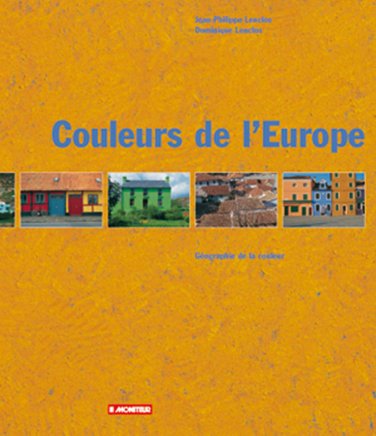
How materials, climate and light have influenced building in Europe. By emphasizing the cultural, functional and decorative diversity of architectural polychromy, this book informs us about the socio-cultural behavior of Europeans (Ireland, Scotland, Denmark, Germany, Belgium, Portugal, Italy, Greece). Faced with the danger of a universal and uniform culture, this exceptional book seeks to highlight, in its proper place, the role of color in the identity of each country and each people of Europe.
By studying the role of color in the identity of countries and peoples, in the face of the danger of a uniform universal culture, this book highlights the role of color in the construction of the specific identity of national cultures. The color finds its rightful place... The resulting synthesis plates constitute a dated inventory of the chromatic, artisanal and artistic heritage of the daily habitat of a community. This research is part of an original approach which, by its references to people, times and places, is similar to that of the human sciences.
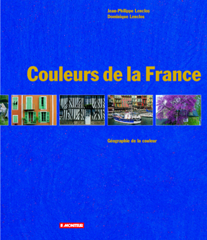
The contribution of color to the beauty and harmony of traditional housing in France. A conservatory work of the use of color, through 18 regional studies, magnificently illustrates the diversity and richness of the architectural heritage of the French provinces. This reference book is an indispensable working tool for any professional concerned with building or renovating while preserving the unity and quality of the landscape, while opening up new and rich perspectives.